

Understanding Charts on Sigma-L: Essentials
Our time frequency analysis is a bespoke technique which utilises techniques from several scientific fields. In this article we explain some of the essential aspects of the charts for subscribers

New! After reading this, take a look at Part 2 of Understanding Charts on Sigma-L which outlines the latest changes.
Price Action
Time Series

Starting with the basics and using USDCAD as an example here, price action per unit time is displayed using ‘candlesticks’ of high, low, open and close price, on individual instruments. For the actual wavelet analysis only the close price is used. The name of the instrument being analysed is displayed on the y-axis.

A composite analysis is any analysis comprising two or more instruments. We typically use this to increase the signal to noise ratio amongst commonality instruments which are highly correlated. The concept is used widely in neuroscience (ERP via an EEG analysis) and uses the simple process of averaging to emphasise only those parts of the signal that are phase locked over time. The surviving signal is more likely to be the dominant component across all instruments in the composite. The price action displayed here in white is the averaged close value of the mean centered time series per instrument in the composite. Instruments within the composite are displayed in dark grey and will typically show variation via amplitude modulation.
Low and High Pass Filtering

Within the main price action we often show a representation of smoothed price, in yellow. The low pass filter is formed by allowing all frequencies lower than the lower bound of the bandpassed region (in white, see below, time frequency) to pass. This is typically useful to view the underlying trend and how the signal that is being investigated is influencing overall price action.
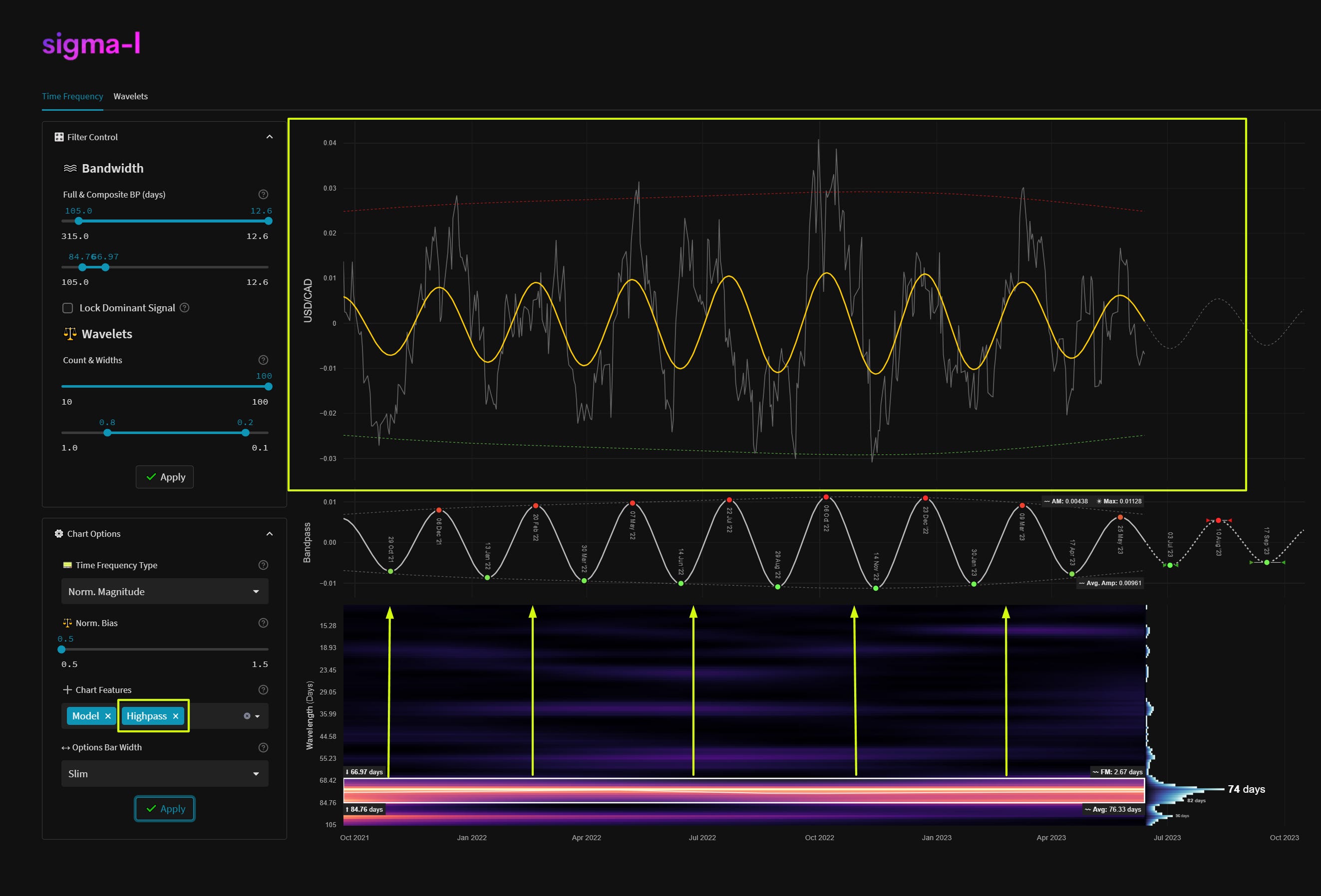
Highpassed price is very useful because it approaches a mean reverting time series, usually around zero. We apply a high pass filter to price action, retaining frequencies higher than the upper bound of the bandpass region, in white. The passband of the highpass filter is shown by the yellow arrows on the time frequency plot. The red and green envelopes on the price action plot represent +- 2 standard deviations of the amplitude envelope. Excursions by price above and below these zones is a high probability reversal area for the component being analysed.
It is an important technical note to mention that the cutoff in both the low and high pass filters used is not as abrupt as shown here and features some gentle rolloff around the bounds of the bandpassed region. We use a Butterworth filter for both approaches on Sigma-L.
Entry Zones

We typically will display time and price based zones for entry based upon the component’s spectral attributes in the bandpassed region. Buy zones, in green, and sell zones, in red, show both typical frequency modulation across the sample (in unit time) and amplitude modulation (in price units) around the entry zone. This is also influenced by the frequency modulation calculation in the time frequency plot (FM). As a rule of thumb the smaller and tighter the zones the better! There will always be some kind of modulation involved in financial markets, cycle lows and highs based around absolute price peaks and troughs are a fallacy.
Time Frequency
Overview and Frequency Resolution
We use a mathematical process entitled ‘complex morlet wavelet convolution’ on Sigma-L to produce the time frequency plots shown in each analysis. For a simple conceptual analysis imagine a sine wave mixed with a gaussian (the ‘wavelet’), as a function of time, being ‘dragged’ across price action.
At each time point the ‘dot product’ is taken, (multiplication and sum) between the function and price. The result of this is a measure of correlation between the function and price. Now imagine that process performed 1000’s of times at different frequencies and timepoints. The end result is an array of dot products - the time frequency plot.

For a more detailed look at time frequency and it’s features in general, please take some time to read the article: Hacking the Uncertainty Principle: Time Frequency.
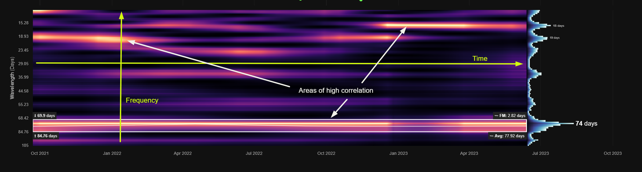

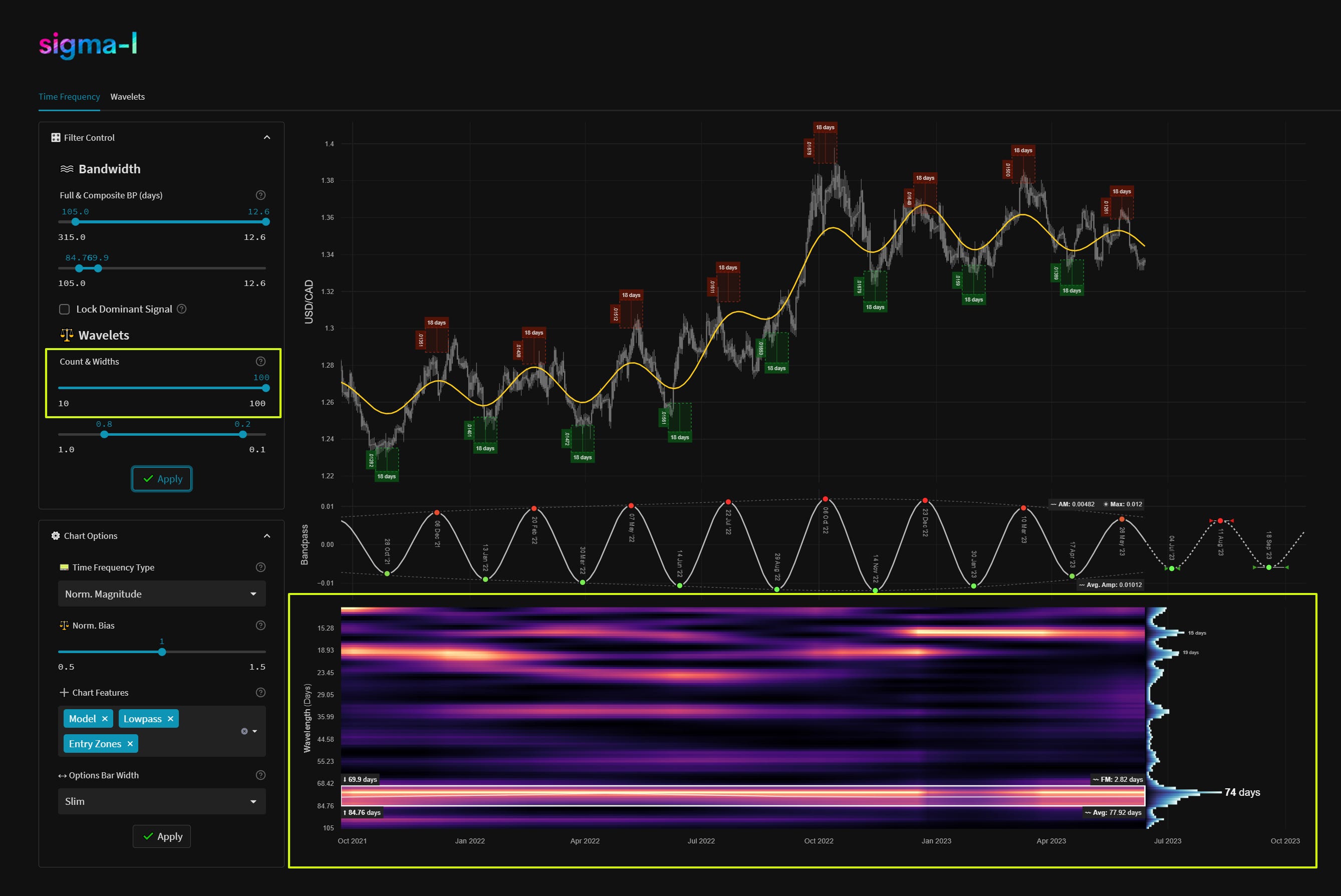
On the time frequency plot we display wavelength (frequency) on the y-axis and time on the x-axis. The colour scale (or heatmap) within the plot relates to the correlation between each per frequency wavelet and price action. In this case lighter yellow represents a higher correlation, moving down to black for lower correlations. The wavelets can also can be thought of as individual precise bandpass filters, each occupying a small portion of the overall bandwidth in the analysis. A strong signal will show as a band of yellow across time. Often signals will modulate in amplitude and frequency. The more reliable signals have minimal modulation over time.
The number of wavelets used in each analysis is defined in the filter control section. Increasing the number raises the frequency resolution as shown above with 20 and 100 wavelets respectively. This in turn allows better spectral separation and observation of frequency modulation over time. Typically on Sigma-L reports we will always use the maximum number of wavelets (100).
Static Spectra

At the end of each time frequency plot there is a representation of the overall magnitude at each frequency. This gives a quick visual summary of the periodic activity across the overall bandwidth defined. Prominent peaks are shown with their associated peak wavelengths. This representation removes any temporal information (frequency and amplitude modulation) from the analysis and is analogous to a simple Fast Fourier Transform (FFT).
Bandpass Region


Upon inspection of the time frequency plot, we can isolate frequency bands of interest and use them to speculate on future price action. The frequencies included in the bandpass region (white box on time frequency plot) are defined in the filter control. We can also automatically identify these regions with our auto detection algorithm and dominant signal selection. The auto detected regions are shown in green and assigned a number dependent on significance.
The bandpass plot is the result of a weighted average of wavelet convolution outputs at the frequencies specified. The frequencies used controlled by either the manual filter control or the dominant signal detection lock, as above. Weights in the average are assigned based upon the magnitude of the output of each filter over time, per frequency.

At the bounds of the bandpass region box we show, on the left, the wavelengths at the margins and, on the right, the average frequency modulation (FM). At the bottom right the overall average wavelength of the identified signal within the bandwidth specified (height of white box) is shown.
This overall average wavelength is the wavelength used to describe the component in all our reports and is suitably indicative of it’s dominant frequency characteristics.

The white line within the bounding box is instantaneous frequency and shows how frequency changes over time within the bandwidth specified. A flatter line is favourable for a stationary and reliable signal.
Extrapolation

Using the spectral properties of the weighted bandpass filter we can extrapolate beyond nowtime. The regions around future peaks and troughs are flanked by bounding arrows, these can be thought of the error terms based upon the modulation in the sample. As time goes on, the uncertainty grows as to the position of the peaks or troughs of the component. The amplitude of the bandpass filter extrapolation is simply assumed to modulate back to the average amplitude from the sample.
Ready for more? Take a look at Part 2 of Understanding Charts on Sigma-L
Thank you David,
This is very interesting. I use the terms “wavelets” for a different predictive method, which I have used over the years in my model.
I was screening Google for older entries using “wavelets” and came across yours, all the while as I was just waiting to receive a book on Hurst.
I love the coincidence, and I was so intrigued, I decided to join. Very intrigued still. I’ll continue to follow.
My handle on Twitter is 4xForecaster and the model I use is called Constant Rescaling Of Wavelets (C.R.O.W.) - Feel free to comment there, if ever interested as well.
Again, thank you and I’ll continue to follow through a well-worth paid membership here.
David Alcindor
Wyoming, USA
Thanks David! Very detailed intro! I have a small question if you have time to answer: generally speaking, should we use return or price as input to the time frequency analysis? Some claim using return gives better frequency information and some claim using price retains more memory, thereby gaining more predictability.