

Understanding Charts on Sigma-L (Part 2)
We have added a few more features to charts you may see on Sigma-L. In addition our new scanner provides rapid and widespread detection of significant cycles in many markets. Let's examine the changes

Firstly, if you have not already studied the original Understanding Charts on Sigma-L post, please do so at your convenience, the underlying mechanisms are largely unchanged.
Main Analysis

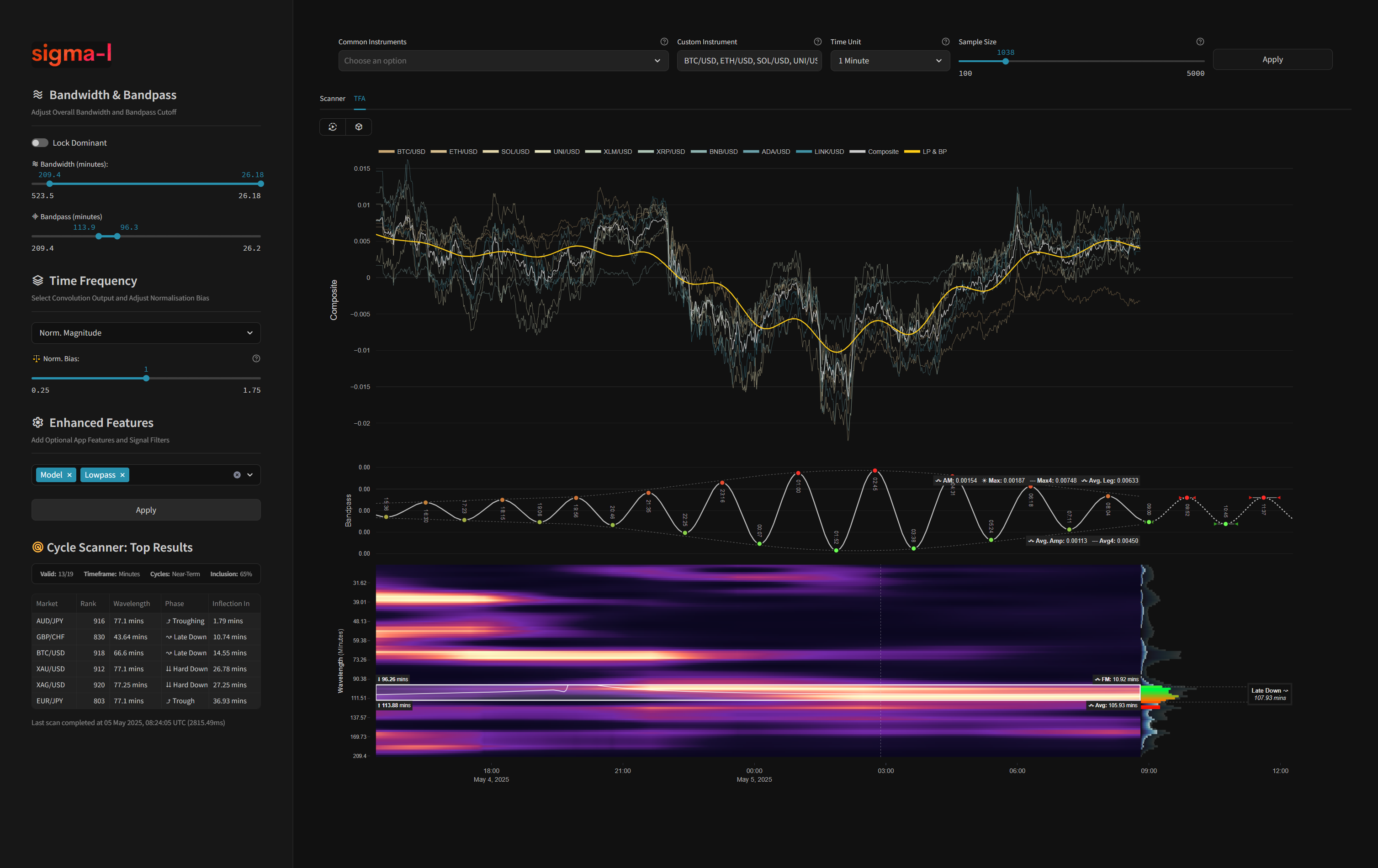
Using the example shown above of US Stock Market indices, via SPY, IWM and QQQ, there are several changes over and above the aesthetic shifts for controls and input that are immediately obvious…
Composite Constituents
For a composite analysis (an analysis of more than one instrument) we have added various colours for the constituents in the time domain. This makes for easier viewing of variance between each and the overall time-domain average (white). Importantly, the time-frequency analysis is performed only on the time domain average of the close prices of each instrument. This allows us to view only those periodic features common to all markets in the composite, improving, in most cases, the signal to noise ratio when compared to a detection of the same component for an individual market.
Cycle Amplitude Metrics
In addition to the amplitude modulation (AM) and maximum amplitude (Max) for the band-passed area of the spectra (white box on TFA), we have added a couple of new measures. The Max4 is simply the maximum amplitude of the detected cycle (band-pass region) multiplied by 4. We use this as a good level for a stop loss in trading, where we do not expect price to increase in volatility (amplitude) beyond 4 times the maximum amplitude of the cycle detected. In the rare case it does it is generally due to news/macro events. The average leg (Avg.Leg) is the average of the actual price legs measured from the inflection points of the band-pass over the whole sample. This gives a broad sense of how much actual price movement is being powered by the detected dominant cycle, per leg.
Recency Marker and Spectra
Frequency and amplitude modulation is constant in financial markets and a major challenge in trading. This motivates the use of a time frequency analysis method to capture both temporal and frequency information from the signal, as opposed to simply just frequency information via a static spectral analysis (like a FFT). As traders we are interested in cycles that are influencing price movements at now-time, with a nod to the recent past, replete with the knowledge that frequency modulation tends to change slowly (amplitude modulation more randomly and less predictably). In order to augment our signal detection algorithm we take two samples of the spectra, one over the whole sample and one from the recency marker point, to now-time. We can then feed these two useful snapshots back into our calculations which further informs our calculation of amplitude, frequency and phase. The two spectra are also shown at the end of the time frequency plot, the brighter being the more recent sample.
Phase and Average Phase
We show the now-time phase of each frequency within the detected dominant cycle areas. These are represented within the recency spectra at the end of the time frequency plot by varying colours, red for peak, moving to green for troughs. As the overall cycle captured by the detected band progresses, you will see these individual colours change, each frequency within the band moving through it’s own phase at now-time. Trivially, these will all be of similar phase but can give a good indication of higher frequencies peaking or troughing first, for example. The average phase is the weighted by amplitude average of the phase values at now-time of all the frequencies within the detected band, denoted by the dotted lines. In the above example the two components at 177.03 days and 270.16 days have phases of hard up and trough respectively. As an aside, these two components are likely the Hurst 20 and 40 week nominal waves.
Cycle Scanner
In order to identify potentially profitable cycles of significance we needed a method to perform the same time frequency analysis across a wide range of instruments, quickly. This is where the new cycle scanner comes in! Our bespoke technique is fast, utilising a stripped back convolution process that will typically analyse a 4000 point market in less than half a second. Under the hood we still use the same time-frequency process that is on full display in the main analysis above but in the scanner’s case we only retain information pertinent to quick trading decisions.
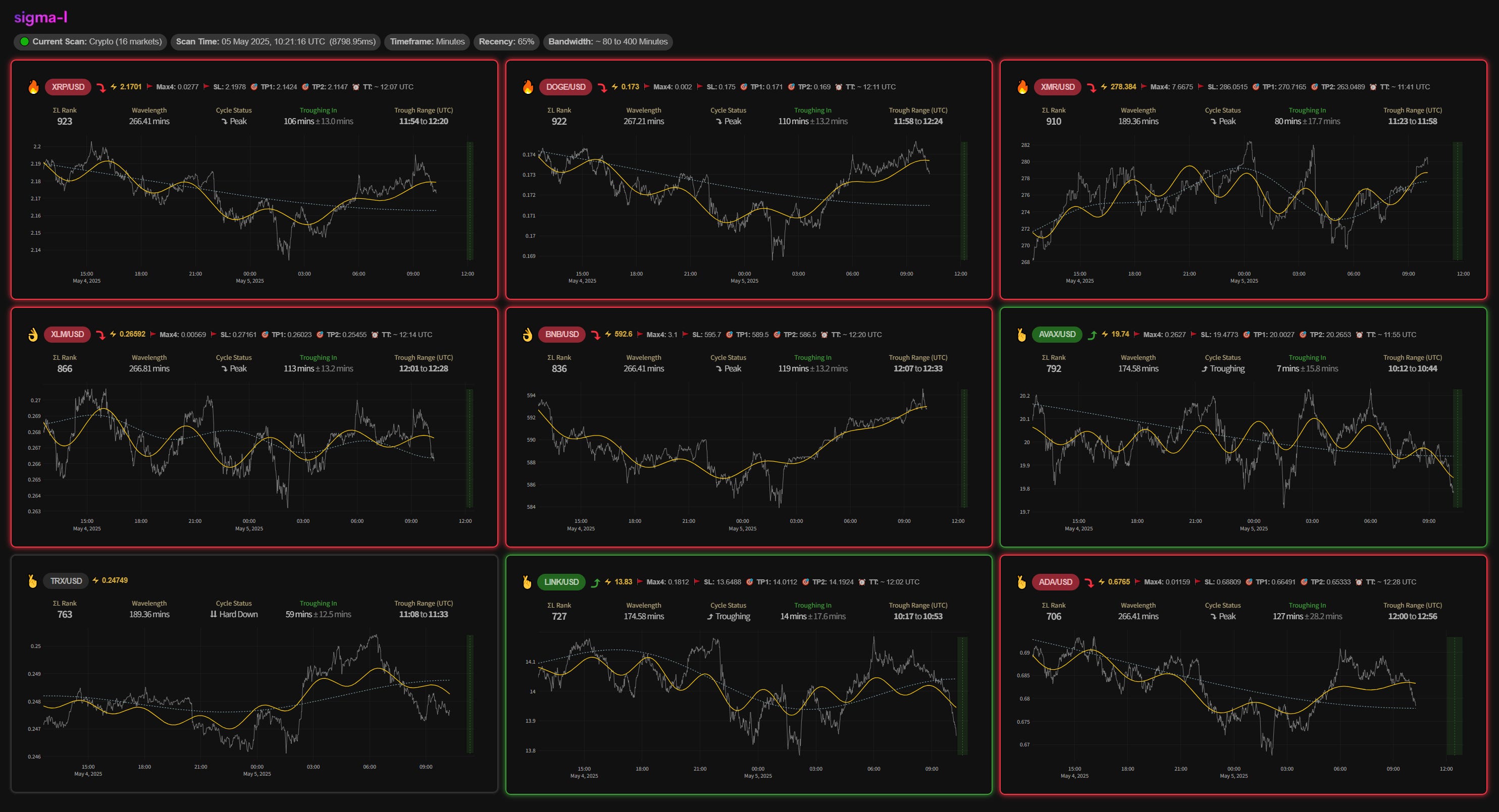
Of course the scanner can also be put to good use on a range of other markets at different timescales. Below the scanner is used on 40 US stocks at a daily resolution, identifying signals of significance (the rank score) and presenting the top 9, in this case. We can isolate a specific bandwidth of interest to use, in the below case it is between ~ 40 and 200 days (that is, the scanner will attempt to detect cycles of significance between ~ 40 and 200 days wavelength).

Let’s now look at a couple of examples more closely to explain the concise information presented for each market.


Rank
Our main metric for differentiating significant signals from our analysis is the Sigma-L rank. This score, an integer from 0-1000, relies on several criteria to arrive at the final measure. Importantly, a score of 1000 would only ever be achieved by a signal represented by a sinusoidal of perfect amplitude and frequency stationarity. So you will never see it in financial markets but it is an important calibration! A non exhaustive list of ranking criteria are: level of noise, distance from noise of the peaks, width of the broader peak (denoting more or less frequency modulation), spectral isolation (how quickly the signal drops off to noise) and how far other significant peaks are from the main peak. A visual representation of rank is shown in the top left. The ‘fire’ emoji represents signals great than or equal to a 900 rank. An ‘ok’ emoji represents signals ranging from 800 to a less than 900 rank. A ‘fingers crossed’ emoji represents signals with rank ranging from 700 to less than 800. A ‘warning’ emoji represents all other signals below 700.
Cycle Wavelength
This one is straightforward. It is the wavelength of the detected dominant cycle in this instrument, within the bandwidth analysed.
Phase Information
This is the real juicy stuff for trading. We have three boxes: firstly the cycle status denotes the current position of the cycle. Trade information is only shown when the phase is either peak, peaking, troughing or trough. Other phases represent mid points of the cycle. To the immediate right of the cycle status is the inflection point countdown and expected range. These show when the next peak or trough is due and within what range it can be anticipated. The range is defined by the frequency modulation calculated from the time frequency analysis output. A tighter range is better, but not too tight! The future inflection point is also shown visually on the plot as a dotted line (the absolute inflection point) and shaded area surrounding, which represents the modulation and uncertainty.
Trade Information
When the cycle phase is appropriate, trade information is presented. From left to right we have: current price (yellow), max4 metric (see main analysis above), max4 stop loss, take profit 1 (max4 1:1) and take profit 2 (max4*2 2:1) trade levels. Finally we have the most important trading metric, that of the time target denoted as TT. This gives the expected future time to exit the trade and is the basis of most trade exits when using this primarily time based method.
Band Pass and Underlying Trend
The yellow band-pass on price is the same as previously shown on all Sigma-L charts. It is the result of a weighted by amplitude band-pass region of the time frequency analysis, related to the detected area of interest. The blue dotted line is simply the first few lower frequency outputs from the convolution and is a fair representation of longer cycle power.


Meta Information

Finally, some useful meta information is shown at the top of each scan result, relating to the scan parameters and some metrics. These include the current scan and the number of markets scanned, the last scan time and elapsed time for the scan to complete. The time-frame, recency bias (see main analysis above) and the bandwidth to target cycles within.
Hello there, I have just joined the paid membership. I would like to ask where I could find access to those cycle charts and the Discord server with live intraday signals?.. I mean, is that a separate membership?